MIRA MIKATI
VISUAL IDENTITY
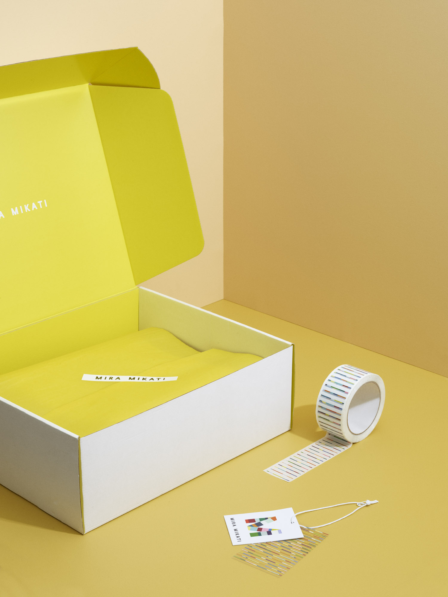
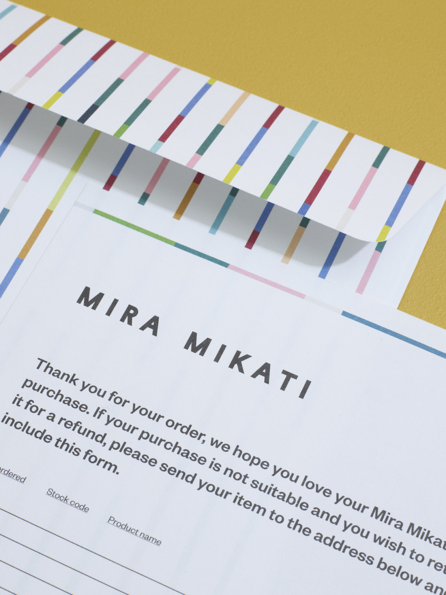
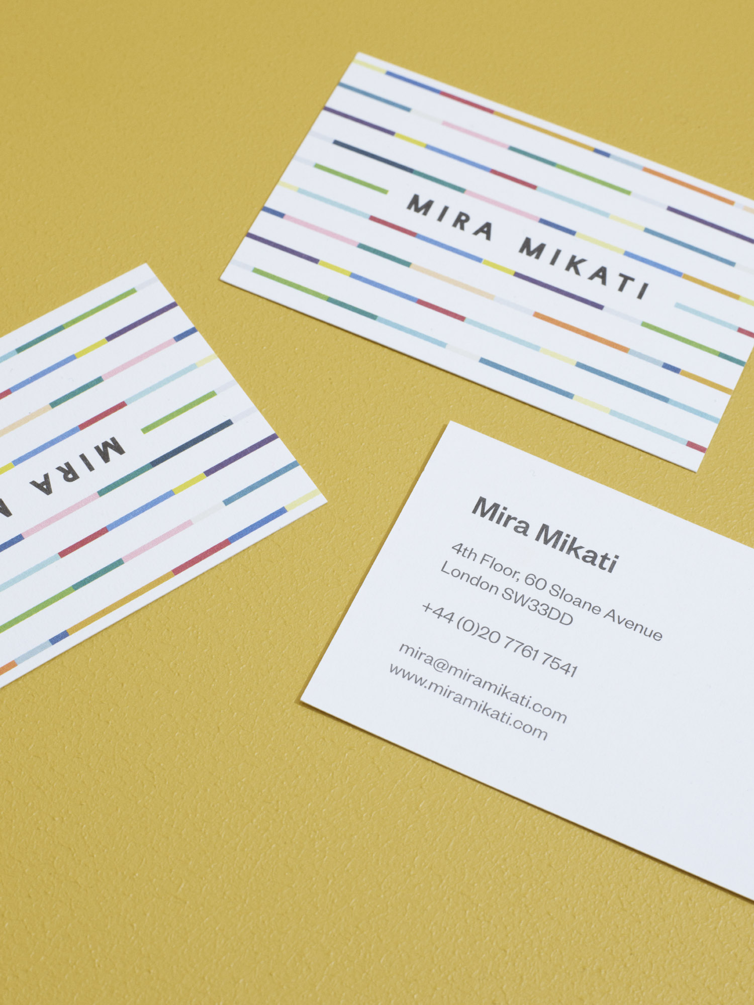
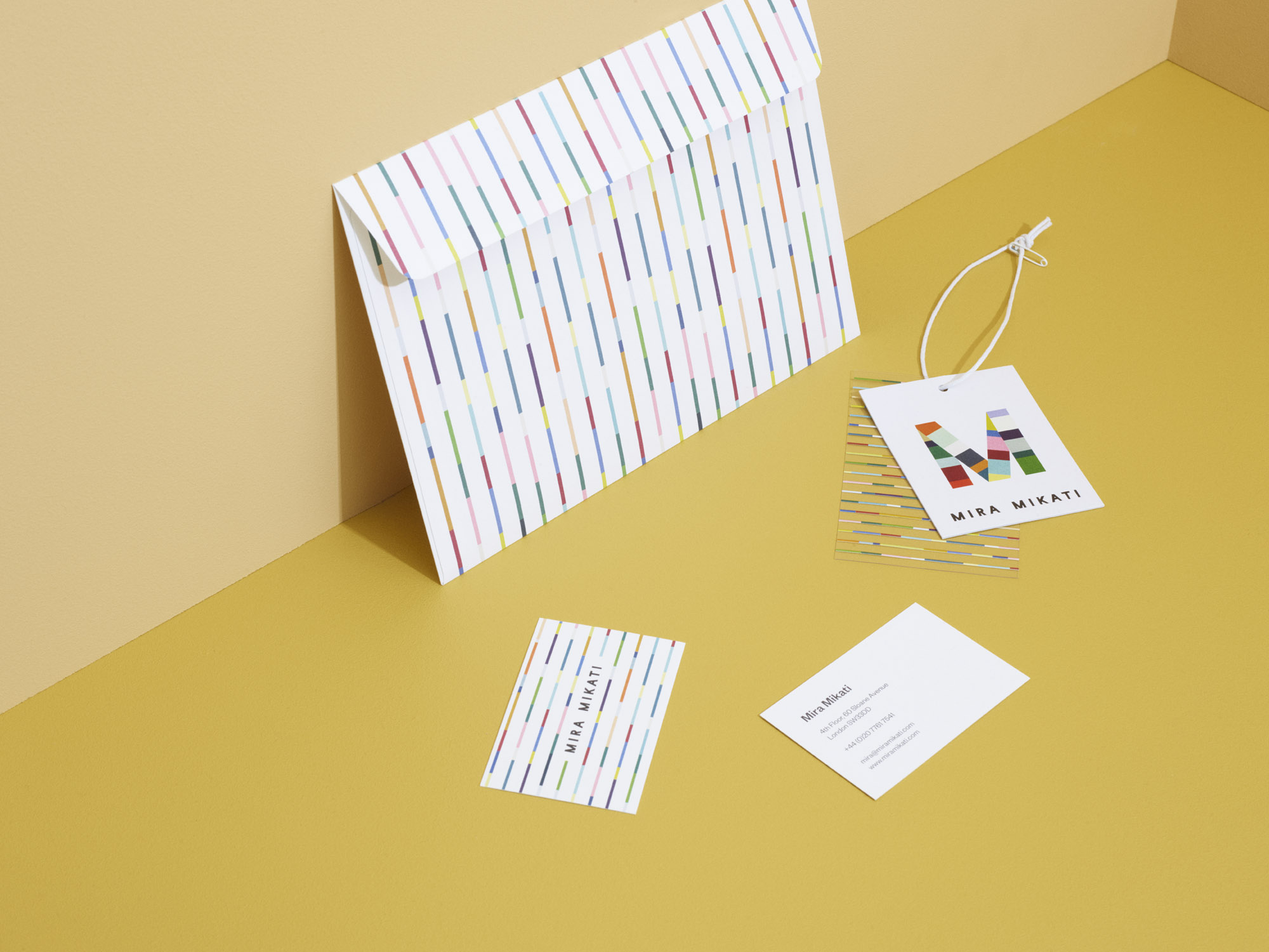
In collaboration with the English fashion label Mira Mikati and the design duo Hvass&Hannibal, Sarah
worked as a visual brand conultant. Sarah was responsible for shaping the brand concept for the new visual identity and the surrounding branding for Mira Mikati.
Mira Mikati is a fashion brand where collections of carefree-meets-cool designs and span the realms of playfully gamine and candidly feminine — all while channelling inspirational undertones hatched from art world collaborations.
Case: Visual IdentityClient: Mira Mikati
Year: 2018
Industry: Fashion
Capabilities: Brand Consulting, Art Direction, Graphic Design,

CRAS
SHOP DESIGN
Sarah Gottlieb Studio created a shop interior for the Danish fashion brand CRAS, the interior reflects the brand’s DNA and their playful approach to the everyday wardrobe - life is a party and it should be celebrated everyday with colourful garments!
Sarah Gottlieb Studio was responsible for the overall concept and design of the shop, they also took on the project build in collaboration with their trusted construction partners.
Case: Shop DesignClient: Cras
Year: 2021
Industry: Fashion
Capabilities: Interior Design, Shop Design, Art Direction,


A SEAT IN SIENA X SARAH GOTTLIEB
COLOUR PALETTE
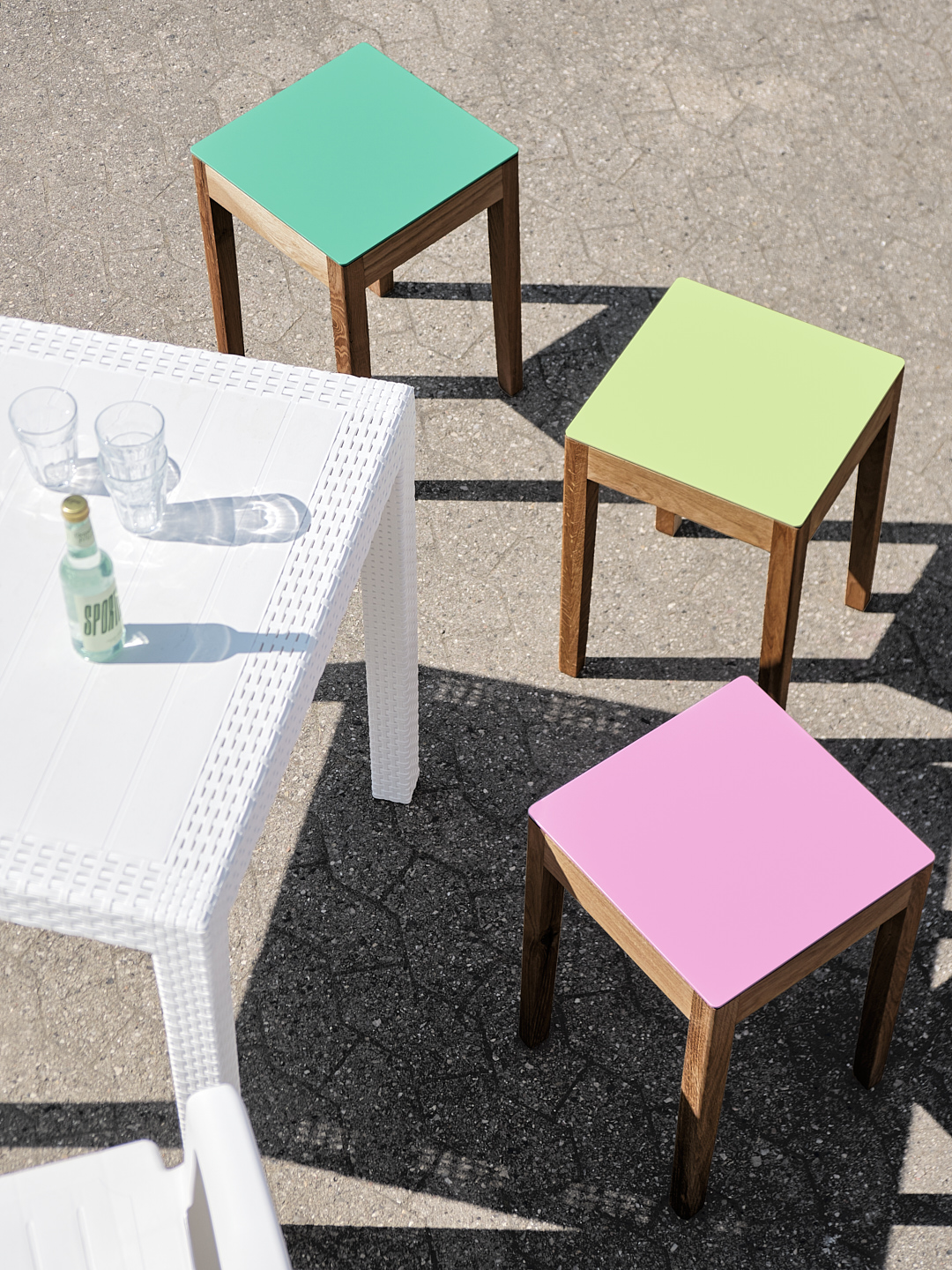
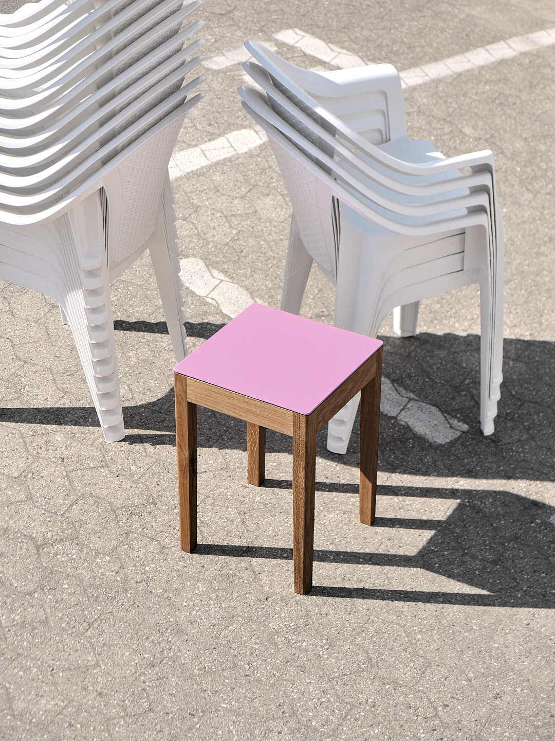
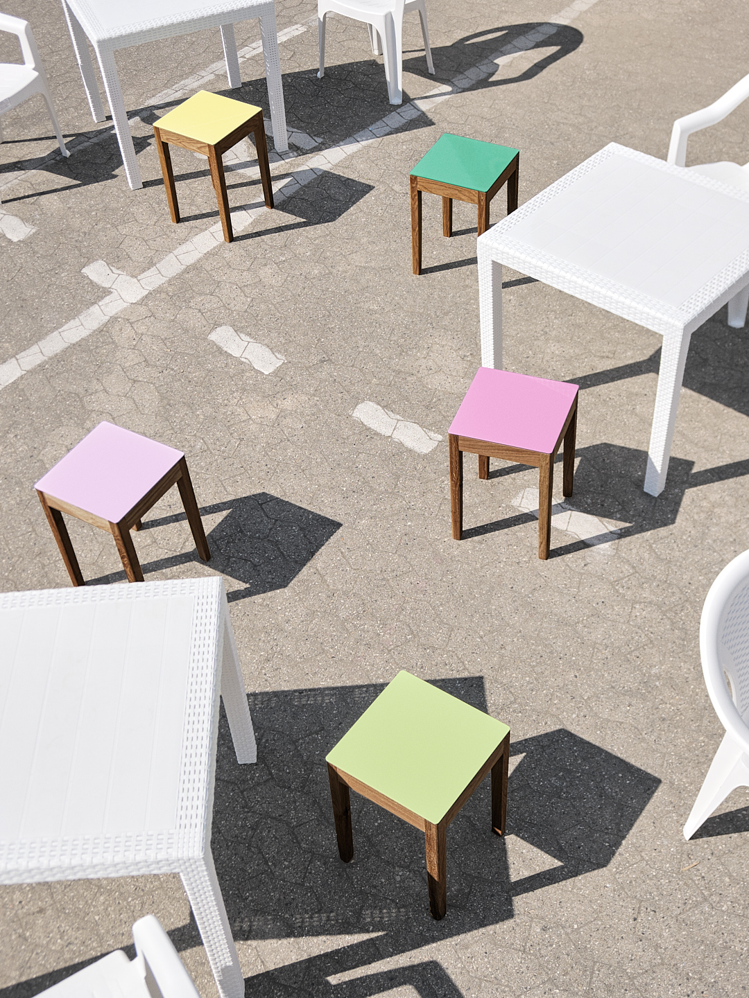
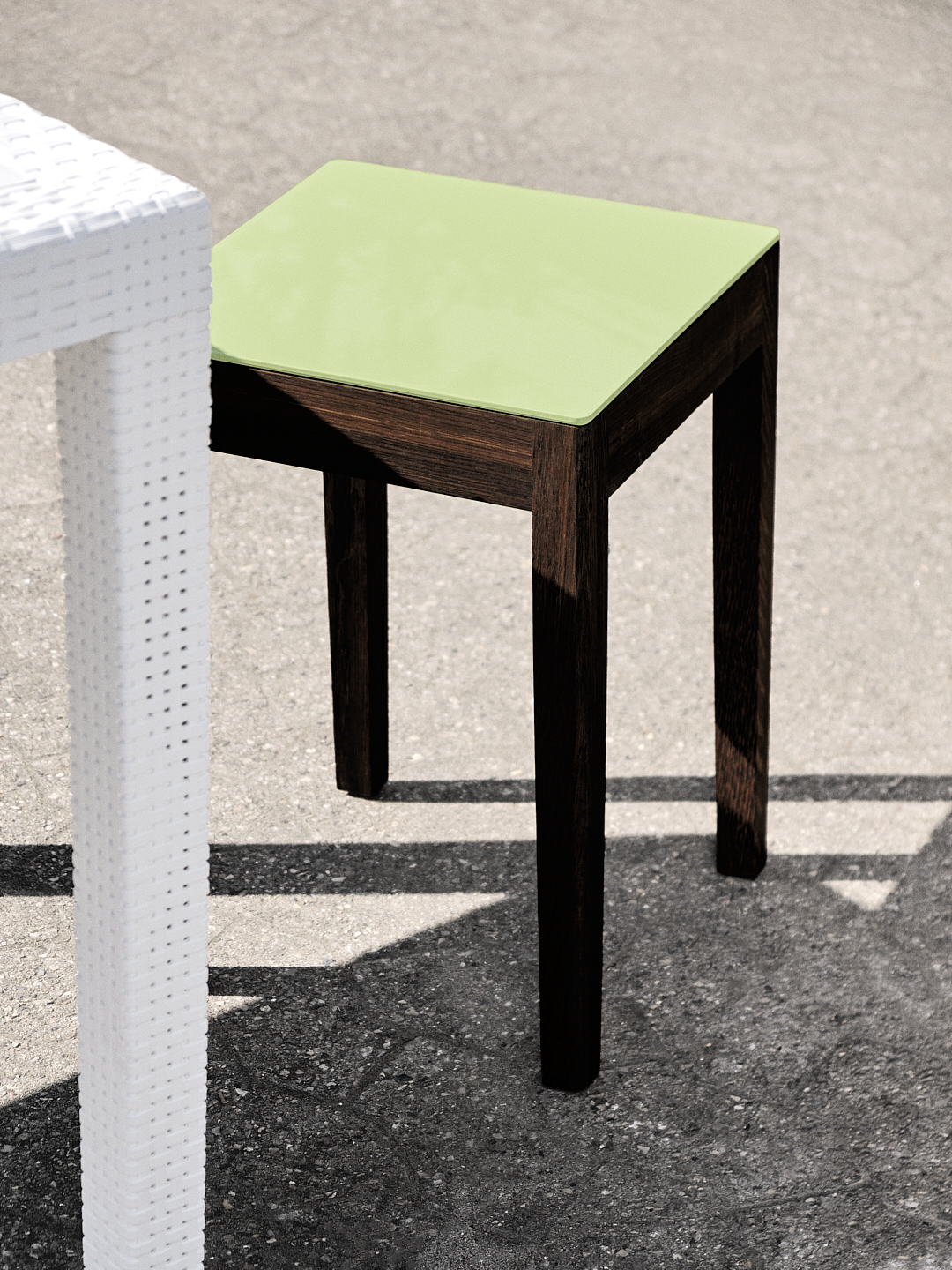
With "The Ice Cream Collection" for A Seat in Siena, Sarah has created a unique series of colours for A Seat in Siena's classic stool. The colours in the collection have been carefully selected by Sarah based on the principle that they should be mouth-watering, edible and, last but not least, summery and modern.
A seat in Siena demonstrates how a desire for sustainable and responsible pro- duction can go hand in hand with aesthetic and multifunctional design.
All stools are made from residual wood left over from larger productions - quality wood that would otherwise not be used. The stools are produced during downtime at the carpentry workshops in order to make the best possible use of working times and production schedules.
Case: Colour DesignClient: A Seat in Siena
Year: 2022
Industry: Product Design
Capabilities: Colour Design

COPENHAGEN LIBRARY
COLOUR INTERIOR
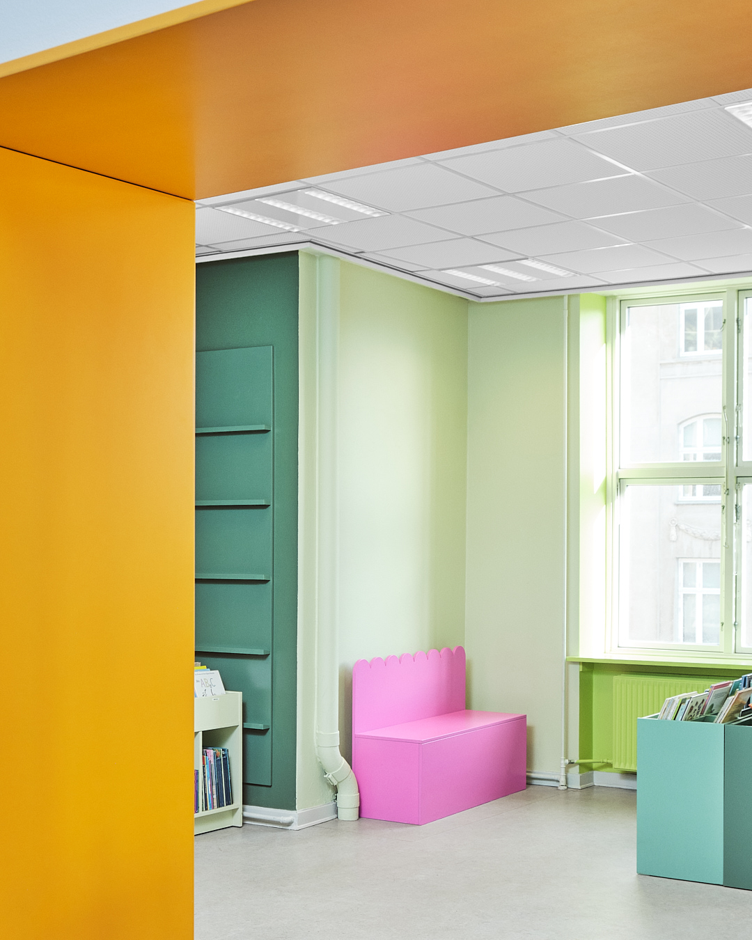
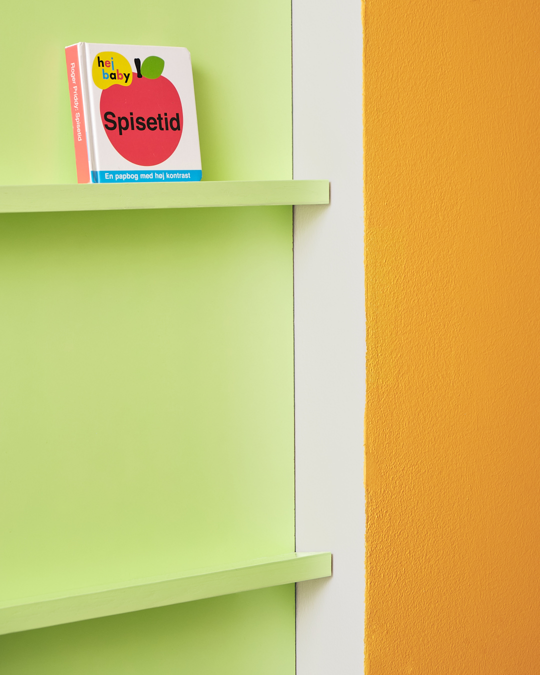
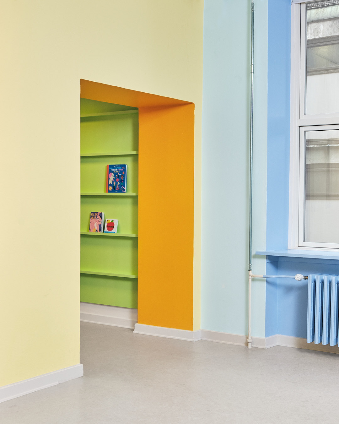
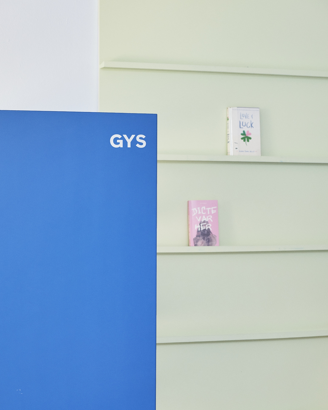
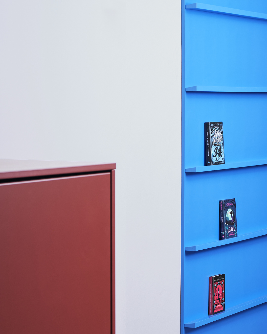
Sarah has completely redesigned Copenhagens oldest public library for children, Vesterbro Children’s Library, solely through the use of colour.
Through an elaborate colour scheme inspired by nature and by the historical and colourful facades of Nyhavn in Copenhagen, Sarah reinvigorated the run down library interior into an inviting, curious, and fun environment for kids to embrace the love of books and reading.
The colour scheme has been developed over three themes, The Forest, The City, and The Park, each occupying a department of the library.
Case: Colour DesignClient: Copenhagen Council
Year: 2021
Industry: Interior Design
Capabilities: Interior Design, Colour Design
Photography: Klaus Langelund Møller




THERESE MØRCH JEWELLERY
CAMPAIGN
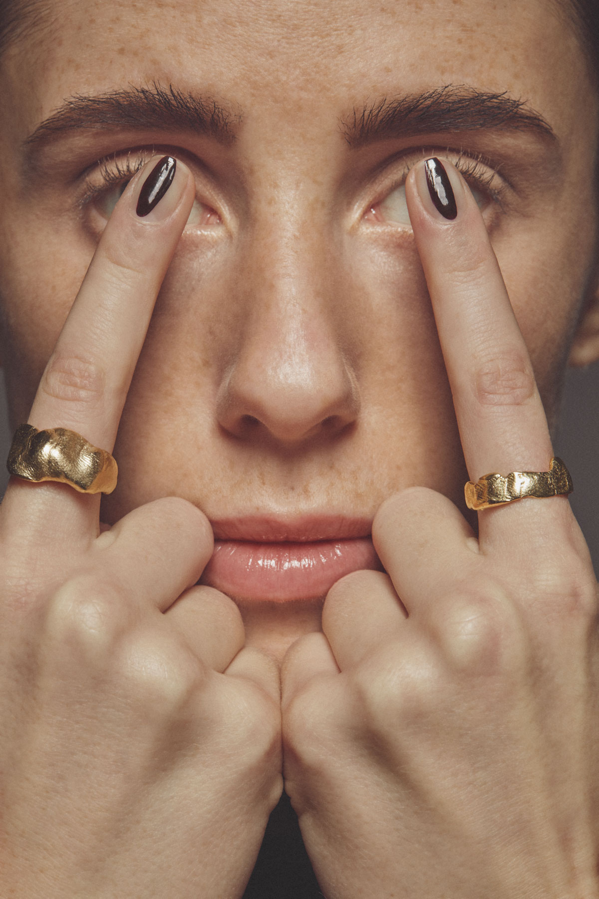
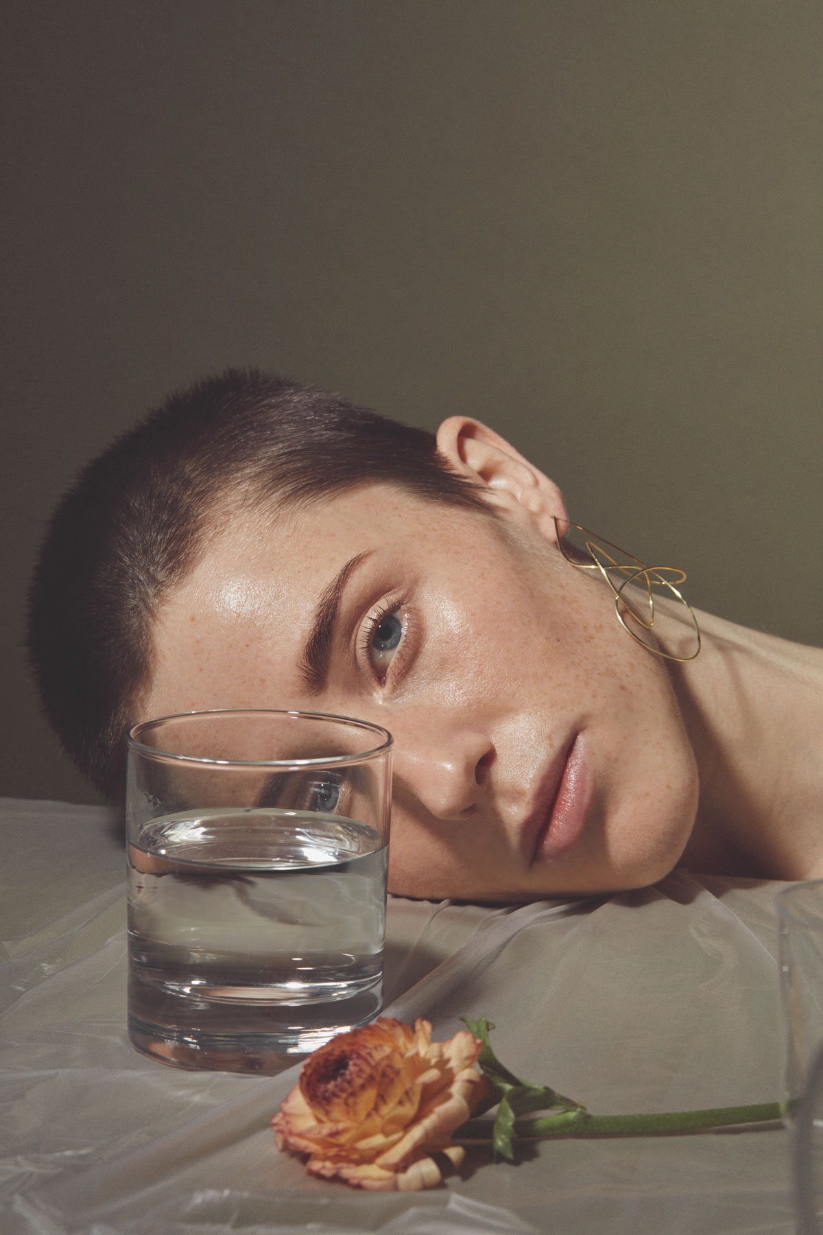
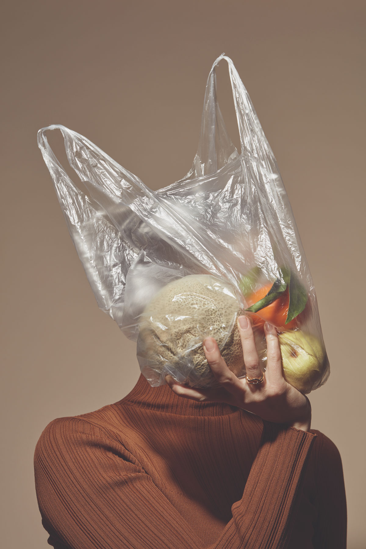
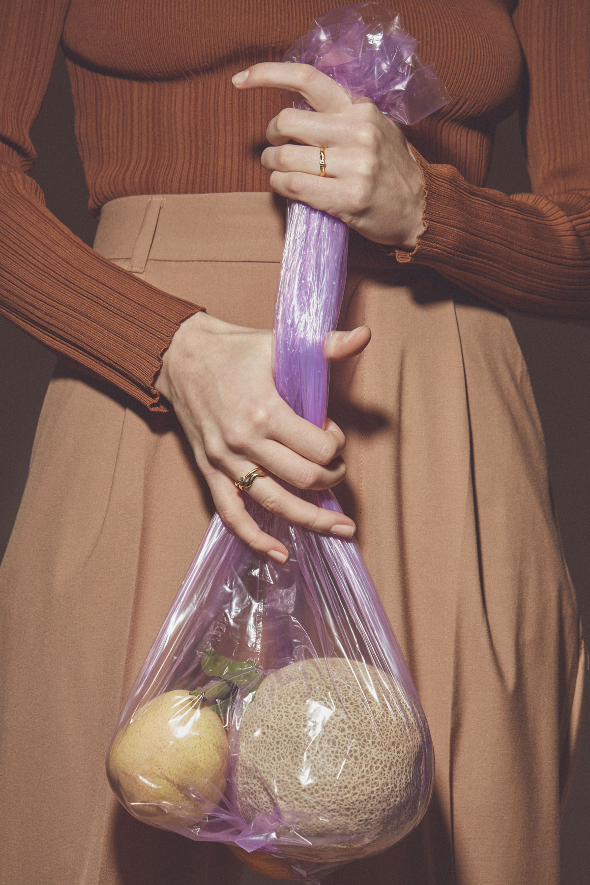
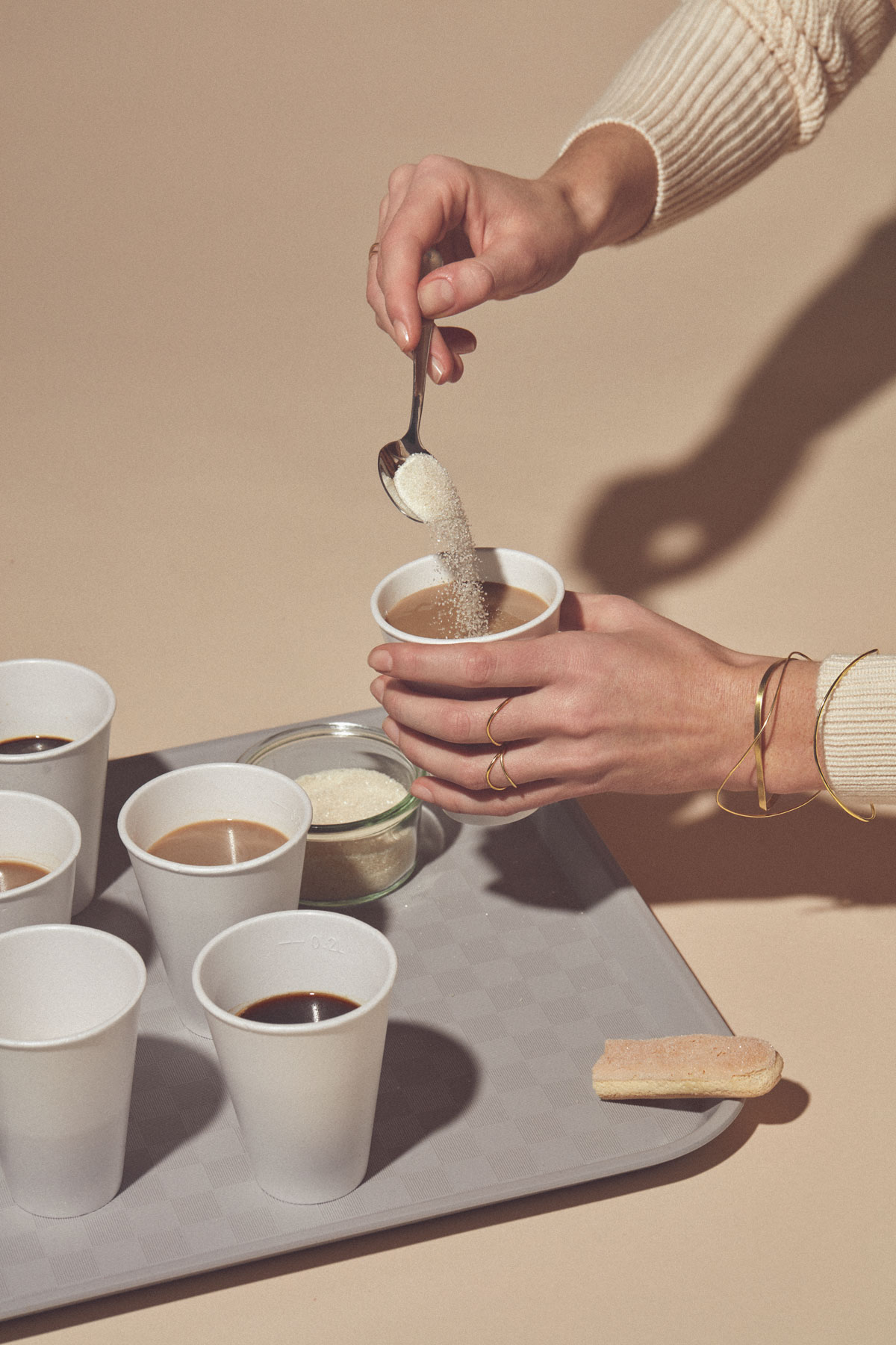
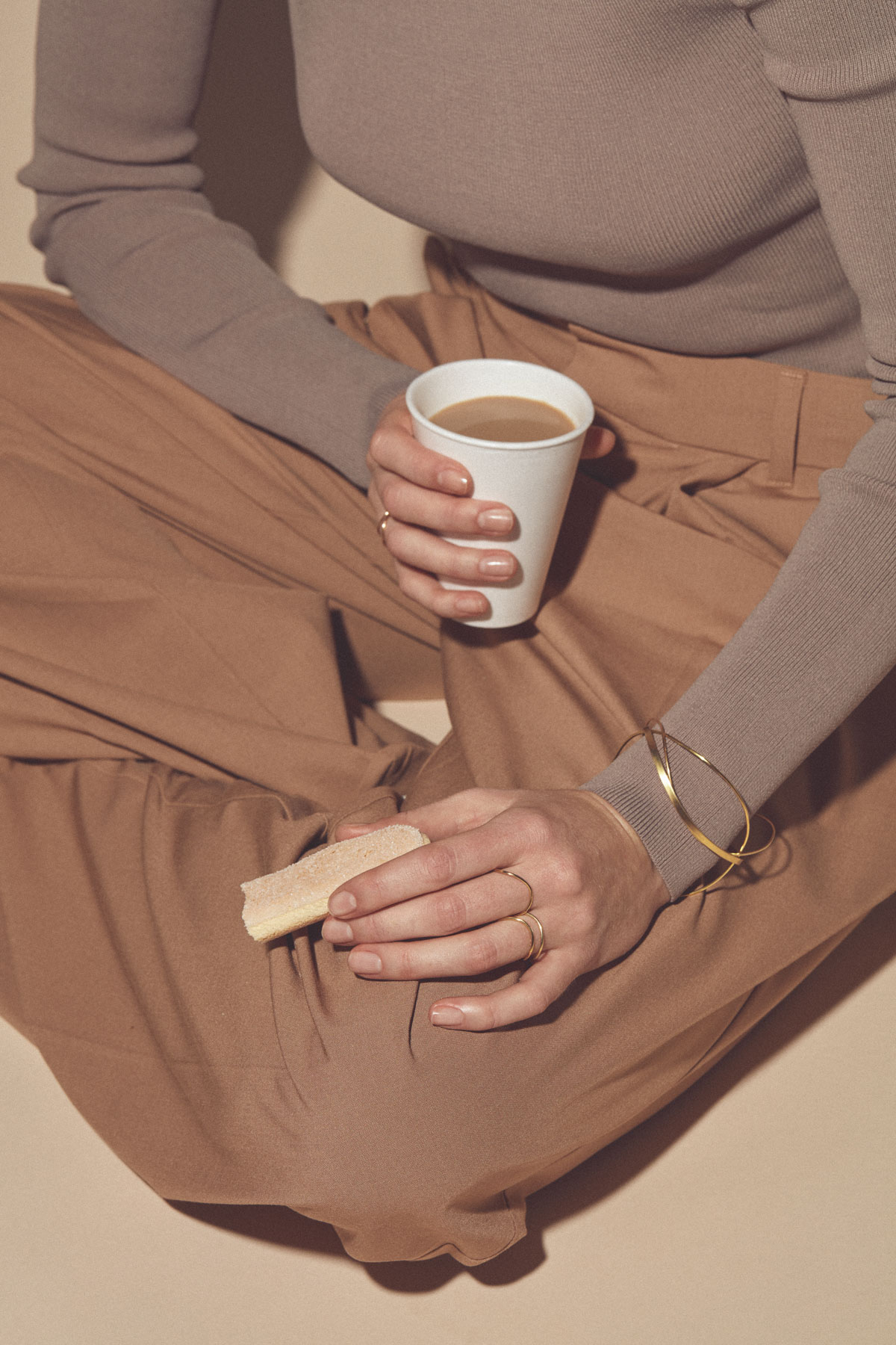
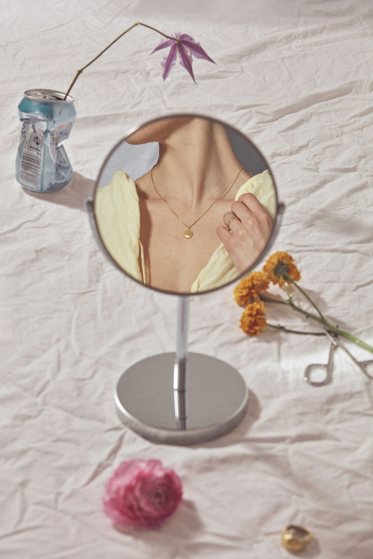
Sarah was responsible for the creative shoot direction of the brand campaign for the Danish jewellery brand Therese Mørch. The campaign emphasizes the brand’s ethos of elevating the everyday.
Therese Mørch integrates concepts of honest simplicity with material respect in relatable designs. As a jeweller she aims to balance essential principles of traditional crafts and goldsmithing with technology in personal style and adaptable, highly bespoke results that portray the wearer in our time. The results are unique, bold and contemporary, yet timelessly classic.
These pieces and collections are not mere adornment, but invitations to celebrate life and rite through some of the Planet's most precious materials.
Case: Campaign images
Client: Therese Mørch
Year: 2021
Industry: Jewellery, Design, Art Direction
Capabilities: Art Direction, Graphic Design, Shoot Concept
